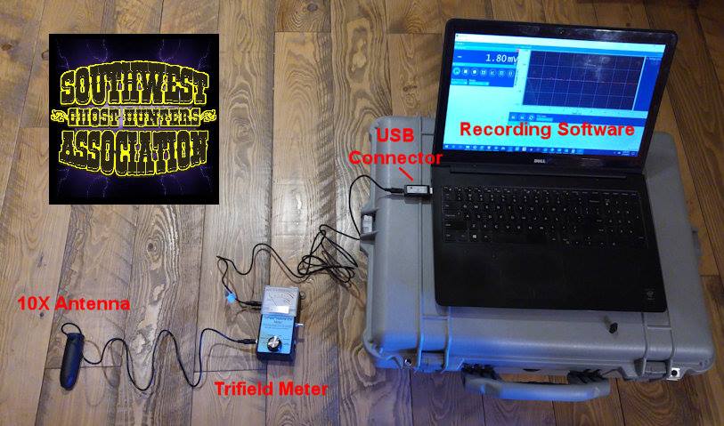
We wanted to share and example of the kind of analysis we do here at SGHA. We just purchased a recordable Model 2 Trifield meter for some electric field tests we are doing and had it out with us the first time on our hunt at the Valverde Battlefield in late December.
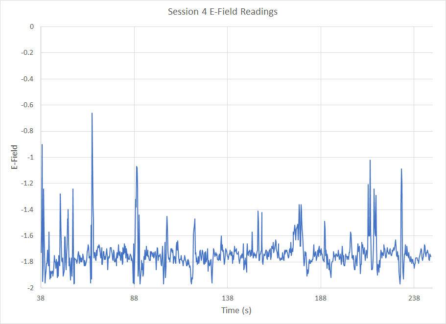
The second picture shows the electric field recorded during an EVP session, and the timing of the spikes looked suspiciously similar to the timing of the questions.
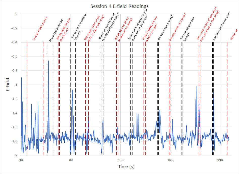
Indeed, when overlain by the questions there does seem to be a correlation!
So did we find something new, or is our desire to find something new introducing a bias so that we see a correlation that isn't really there? To test this, we created 1000 trials that used time segments of the same duration as the questions but placed at random times (though non-overlapping) along the signal. The average amplitude within these time windows was calculated and compared to the average amplitude within the time windows of the actual questions. This diagram shows the results with the amplitude during the actual questions shown as the red dot to the far right. The red lines show the mean (solid) and 90% level (dashed lines) of the trials.
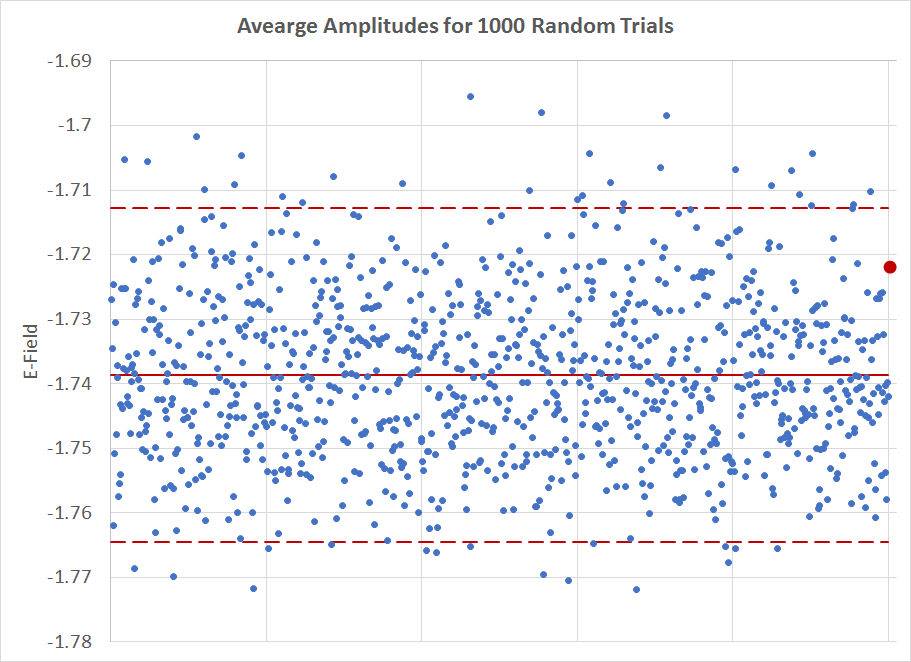
Had the actual question average fallen outside the dashed lines, there may have been an argument to be made that there was some response to the questioning in the electric field data. As it stands, though, the response is no better than chance.Disappointing, but we're just getting started!